I’ve been meaning to uplevel my data visualization skills for a while, and I finally found time to do it. The process is going very slow, partly because it’s a little unclear what “uplevel” means in this specific case, and when I’m going to be “done”.
So far I’ve read two classic (or just old, if you like) books - John Tukey’s Exploratory Data Analysis and William Cleveland’s Visualizing Data. I then picked two random datasets on Kaggle and tried to apply what I’ve learned.
The concrete results of all of it are a little vague - I definitely can’t call myself a visualization expert, but I think I have a better “frame” of basic understanding that I can add to now. The most important insight for me, however, happened pretty early, when I just started reading Tukey’s book.
It turned out that what I really wanted to do was to improve my exploratory data analysis skills, not my data visualization skills. The difference between these two is sometimes subtle, sometimes pretty clear. Both have to do with drawing various plots, so it’s easy to confuse them.
Exploratory data analysis (EDA)
The way I explain EDA to myself is - EDA is concerned with finding structure in the raw data.
“Finding” and “structure” are important here. You’re concerned less with “showing” or “demonstrating” what you found to other people - you’re just looking for interesting stuff in data, trying to get a feel of the dataset. Sometimes you’re not finding anything - that’s perfectly fine.
“Structure” is also different from “insights”. Knowing that two factors are independent tells you something useful about the structure of the data, but it’s not a particularly useful insight most of the time. Other kinds of structure:
- discovering that there’s a group of outliers in your data;
- realizing that the “noise” in data is not normally distributed;
- getting the general pattern of dependency between factor and outcome - is it linear, or logarithmic or some weird non-uniform curve with ups and downs. Note that the dependency doesn’t have to be right in a sense of being a law of nature (Tukey talks a lot about it) - it just needs to be somewhat good at describing the data, and then you “peel it of” and look at what remains, and sometimes you find more structure in the residuals, and sometimes what remains is just a random noise.
EDA is not quite data analytics or data science - people working in these disciplines should be reasonably good at it, as the first step of working with data, but they are rarely being paid for the EDA, what matters is the things they do after it.
EDA involves building a lot of plots, but that’s simply because humans are fairly good at detecting structure with their eyes. Not super good, though, and there’s a lot of tricks and techniques to help the eyes see better - non-linear scales, fitting curves, smoothing out data, adding various annotations, strategically placing two plots next to each other.
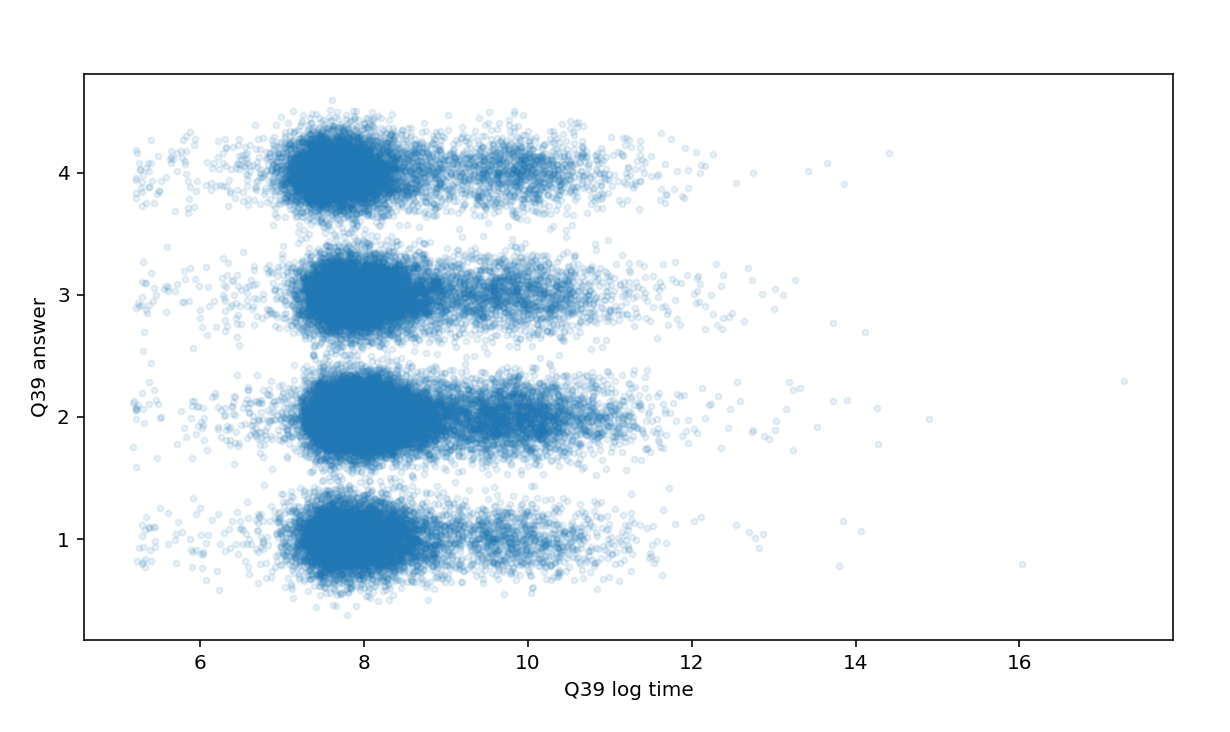
The plots don’t have to be pretty, though. This one is ok for EDA, but quite terrible from the point of view of classic data visualization:
Data visualization (DataVis)
Data visualization, on the other hand, is mostly about presenting some important thing(s) about your data to other people in the most clear and direct way possible. It usually starts when you already have an important insight or an obviously significant dataset, like COVID cases data, and you want to present it in a most efficient and usable way.
There’s plenty of books about it, e.g. by Edward Tufte and others, there’s a Data Visualization Society with a beautiful Nightingale blog. Overall, it does look more like a self-sufficient field (a job, in some cases) than EDA 1.
It’s all great, but the biggest learning for me was that I’m very interested in improving my EDA skills and only marginally interested in DataVis.
So what?
I guess that’s just a lot of words to explain that EDA is what you do mostly for yourself when starting out with a new data set, while DataVis is all about producing something for other people.
Or, EDA is about building a lot of ugly looking plots quickly, while DataVis is about building one beautiful graphic that will explain it all.
Anyway, so far I found that being aware of the distinction is a “magic lantern” that helps me quickly make sense of the vast landscape of Python libraries for data visualization and even bigger zoo of data visualization tools and products. For example, Google Colab and Observable may look pretty similar on the surface - both are notebooks for working with data - but you don’t have to look too long at both to realize that Observable is firmly in the DataVis camp, while Colab is better suited for EDA.
Being aware of the differences also helped me better understand what I should focus on to improve my EDA skills. Some of it is pretty obvious. Committing a bunch of Pandas idiosyncrasies to a “muscle memory” seems to be a must for efficient working with data in Python. Other things are narrow in focus - e.g. knowing which library to use to draw QQ plot and do a simple curve fitting, how to put data on a world map or how to add a simple interactive widget in Jupyter notebook that will allow to quickly experiment with parameter values for a plot.
EDA in the year 2022
Reading old books has its benefits - helps me focus more on the basic underlying principles than on specific technologies available at the time of the book writing. But it’s hard to ignore how much the landscape has changed since Tukey’s and Cleveland’s books were written. 2
The books spend a lot of time looking at the data with just two or three variables. These days, most of the datasets have dozens if not hundreds of columns, and I’m not sure exactly how people efficiently do any analysis on them. There are some libraries that automate simple stuff - e.g. you can feed your dataset to Pandas Profiling and get basic stats about each column and more interesting stuff like correlation analysis if the data set is not too large. Maybe in the future people will just feed the data into an ML framework and let it figure out all the interesting parts 3.
Being able to quickly add interactivity to graphs often removes the need for specialized graphing techniques for working with multivariate data. E.g. Cleveland uses coplots a lot, but in a lot of cases you can just add an IPython widget to control one of the factors and refresh the graph - seems to be much easier to explore data this way.
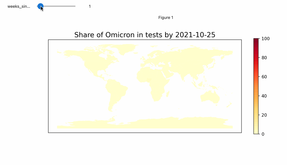
A lot of datasets now have some geographical data in them, so being able to quickly put data on a map is a core skill.
What’s next?
I’ll probably spend more time looking at a few Python plotting libraries to see what else besides Matplotlib might be useful for EDA.
Questions? Feedback? Ping me on Twitter.
-
The fact that EDA is too small and is not an exact science makes it a little hard to teach. It doesn’t fit very well into your typical serious statistics course, so people who studied mathematical statistics (like me) are less likely to know about EDA than people who did physics or biology. ↩︎
-
Tukey spends a lot of pages giving advice on what type of paper you should use when plotting your data. Too bad, the book has a lot of traits of timeless classic, but it was impossible to write a timeless classic about EDA in 1977. ↩︎
-
In which case I guess EDA is about to become obsolete and I just wasted a bunch of time learning dead knowledge. ↩︎